Case study · Product design · Healthcare
Cutting clinical task time 50% by redesigning an EMR around a 15-minute visit
- Company
- Zoomcare — urgent-care network
- My role
- UX Design Manager
- Team
- 6 designers, 6 product domains
- Timeframe
- 2022–2024
- Tools
- Figma, Knapsack
- Status
- Validated in clinic testing; business pivoted before rollout
- Problem
- Zoomcare's business ran on a 15-minute visit, and its EMR was slowing every one down.
- What I did
- Ran the clinic research and design sprints, directed the hardest workflows hands-on, and built the design system, while managing a team of six.
- What happened
- Task times dropped more than 50% in timed testing. The business pivoted before rollout, so most of it never shipped.
A 15-minute visit, and an EMR slowing it down
Zoomcare sold speed. A patient could walk in, get examined and tested, receive a diagnosis, and leave with medication in about 15 minutes, and that number was the company's key metric. It took tight choreography between providers, medical assistants, and front-office staff, and the Electronic Medical Record was where that choreography held or fell apart.
It was falling apart in small ways: fragmented workflows, screens that behaved differently for the same task, and enough technical debt that new features shipped slowly. In a 15-minute visit, one minute spent hunting through a chart is nearly seven percent of the visit.
Where I sat
Mine: the research, the design direction, and the design system. I ran the design sprints and the inquiry sessions with providers and staff, directed the designer screen by screen on the hardest workflows, and took the component library from documentation to implementation. I also hired and managed the six designers who owned the product domains, and set the modernization sequence with product and engineering.
The team's: the screens themselves. Each designer owned a domain and its screens. My job was making that work consistent, fast to ship, and grounded in what clinicians actually did.
Fix the system under the roadmap, and keep clinicians close
- Build our own components. The off-the-shelf library already in place was implemented badly enough to cause more inconsistency than it solved. I didn't stop feature work to fix it. We documented, drove implementation hard, and built our own components as we went, so the system improved underneath the roadmap.
- Condense with care. Most of the work was restyling and condensing screens. We went through every user task and requirement first, because condensing is only safe once you know which steps earn their place.
- Keep clinicians in the room. A standing group of advising physicians met weekly, and the bigger workflows got design sprints with real clinicians testing before anything was built. Review became the place where work got made instead of judged.
What the Refresh button was for
The research turned up what everyone expected: the same action looked different depending on where you hit it, so fluency never carried from one screen to the next. The finding that taught us something came from watching people wait.
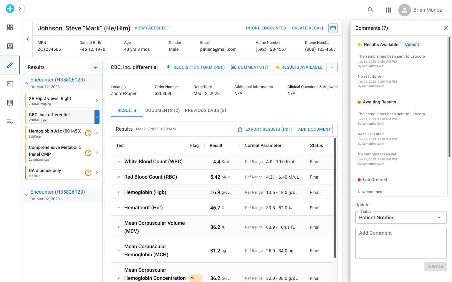
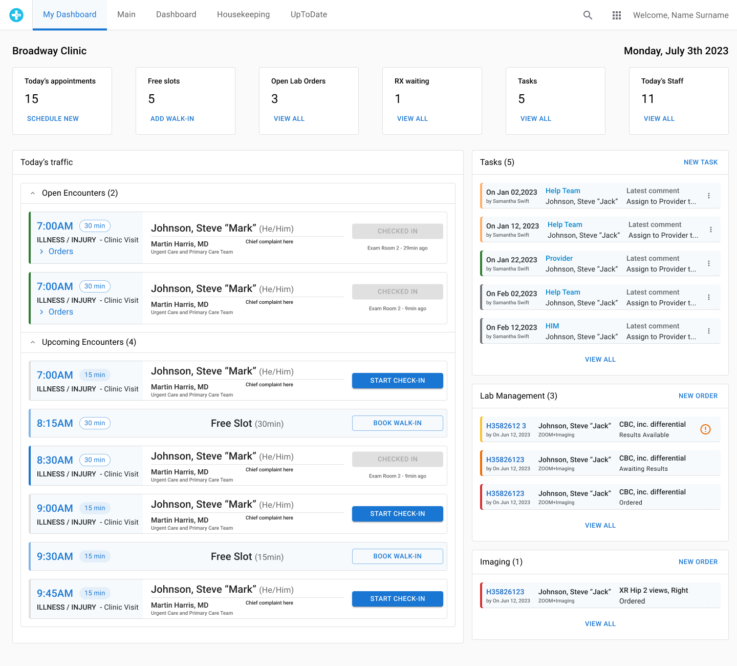
For providers, a design sprint produced an air-traffic-control view of each visit: what had been identified, what was ordered and still pending, and which results had come back and needed action. Medical assistants and front-office staff were a different story. They kept hitting Refresh while they waited on lab results. We read that as a slow system, so we made it update in real time and took away the need to refresh.
They hated it.
The tempting move was to explain why the new version was better. We went back and asked instead, because the rule on that team was that if something worked better technically and made someone's job harder, we'd solved the wrong problem. Refresh turned out to be how staff stood watch. A result landing was the cue to start the next step, and pressing the button was how they knew they hadn't missed it. Some teams had gone as far as earpieces, so a provider could call out an order before the software caught up.
The real problem was trust. The screen had to look alive enough that nobody felt they needed to poll it, so the redesign leaned hard on visible change: toasts when results arrived, motion on anything that needed attention, and state changes nobody could miss.
Doctors asked for less information
Leadership's direction sounded obviously right: connect to the health information exchange so providers could see a patient's outside history while they treated. We brought the concept to the weekly provider session, and the doctors begged us not to put it in their main view.
Their reasoning was clinical. A provider is responsible for addressing what's in front of them, so a full longitudinal record arrives as a pile of new obligations inside a 15-minute visit. Hiding it wasn't an option either, because the right piece of history can change a diagnosis.
So we ranked imported data by clinical relevance, with medications near the top, and surfaced the most relevant items directly in the encounter. Everything else sat in a drawer the provider could open for deeper context. The system did the sorting. The judgment stayed with the doctor.
I can't tell you this one shipped. The thinking holds up anyway: an executive asked for more information, and providers needed less of it, chosen better.
Getting design into the room where specs get written
When I arrived, design got finished specs and made them look right. Most of what made the work above possible was changing that: designers in spec writing, strategy, and roadmapping, so problems reached us before the answers did. Measured against the Nielsen Norman Group's UX maturity model, the practice went from a 2.5 to a 3.5 in a year.
50% faster in testing, then a pivot
We timed eight clinic staff, a couple in each in-clinic role, running the same four workflows in the existing EMR and then in the new prototype: charting a visit, ordering labs, ordering referrals, and tracking internal tasks like follow-ups. Same people, same tasks, both systems. Completion times dropped more than 50%.
Most of it never shipped. The business changed direction before rollout and took the modernized EMR with it, along with the design system, the live-results work, and the health-exchange design.
That still stings, and I'd rather say so than spin it. What survived is a validated approach to a hard clinical problem, and a lot of what I know about designing for people who can't afford to wait on software.
What I'd do differently
More proactive storytelling: showing wins like the task-time results to leadership more regularly would have built even more momentum for the modernization while the business case was still open. And I'd embed quantitative usability metrics directly into the design system's governance, so every new pattern ships with a measurable definition of success.